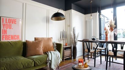
When the owners moved into this four-bedroom 1920s terrace in Blackwood, Caerphilly, they immediately saw its potential. It was plain, white and boring, making it a blank canvas with dozens of renovation possibilities. The couple were initially attracted by the high ceilings, the location and the room sizes the house had to offer. And it was a bonus having a spare bedroom.
The kitchen was on its last legs, but they thought they could live with it for a year or so whilst they saved. However, the previous owners had installed pre-used cabinets which didn’t fit the space properly. There were gaps in the units, and there weren’t enough work surface or sockets. So after giving each bedroom a quick lick of paint, the owners began work downstairs.
The living room
(Image credit: Future PLC/Katie-Jane Watson)
The owners started in the living room while they decided what to do with the kitchen. All the rooms in the house were box-like, with absolutely no interesting features. They wanted to add character and inject a bit of charm to each space.
The first thing they did was attach a picture rail, coving and ceiling roses in the living room. These relatively easy additions immediately transformed the space. The owners painted the room in Sapphire Salute by Dulux. They wanted dark walls and felt the blue living room could take it. The large bay window lets the light flood in during the day, and at night it becomes warm and cosy.
(Image credit: Future PLC /Katie-Jane Watson)
The alcoves were originally empty but had great potential for display and storage. The owners made cupboards out of MDF, then added the delicate panelling and shelves above. These were mirrored for the understairs living room storage idea.
When the cupboards were finished, the shelves looked a bit bare so the owners jazzed them up with easy-to-apply self-adhesive wallpaper, from Dunelm.
The kitchen
(Image credit: Future PLC/Katie-Jane Watson)
A neutral white kitchen idea and wood units were the order of the day. ‘I get bored with a scheme easily, so I didn’t want to choose a bold look that I’d be desperate to change in a few years,’ explains the owner.
They designed the kitchen using Howdens digital kitchen planner. Luckily it was delivered two days before lockdown, so the owners could fit it while they were stuck at home. This also saved a fortune in labour costs.
The couple chose a stylish wooden up-stand instead of busy tiles, and accessorised with rose gold and copper to warm up the soft grey units.
The kitchen-diner
(Image credit: Future PLC /Katie-Jane Watson)
One day the owner was tapping the walls and discovered that the flush wall along the back of the dining area sounded hollow. They decided to investigate and discovered a hidden fireplace and alcoves behind a false wall, which had all been boarded up.
‘This gave us some extra space to play with,’ the owners explain. ‘So we made and fitted the cupboards and shelves, which added much needed storage.’
The bathroom
(Image credit: Future PLC/Katie-Jane Watson)
The bathroom was one of the biggest selling points for the couple, especially the large bath and the slate wall. The unit under the sink was originally a dark brown wood-effect that really didn’t appeal, so they updated it with a streamlined white cabinet, then finished off the look with this bathroom wallpaper idea, from B&Q.
The owner tells us, ‘We bought the ladder initially to stand against the wall to hang towels, but I had a lightbulb moment and decided to create a feature by hanging it above the bath with some simple chrome chains.’
The master bedroom
(Image credit: Future PLC /Katie-Jane Watson)
For upstairs, the couple wanted to add more Victorian-style features. In the master bedroom they chose a simple panelling design that was classic and timeless, rather than a more modern, chunky style. ‘I chose two soft, muted pinks for the walls, as I wanted the room to feel feminine and romantic, but not too girly,’ the owner says.
The dressing room
(Image credit: Future PLC/Katie-Jane Watson)
The dressing room was the last space to be completed. It was the most precious space for one of the owners who gets up at 4am every day for a 6am start at work. So although it was a real luxury, it’s great for them to be able to get ready for work without disturbing anyone else.
This room was designed around the ‘Vintage’ sign, from Maison du Monde. The dressing table is an original Stag design from the 60s that has been upcycled with a bold green and gold look. The bedroom wallpaper came from B&Q and the gold torso came from Creed Revival and was colour matched to the room.
The kid’s bedroom
(Image credit: Future PLC /Katie-Jane Watson)
This girl’s bedroom idea was originally going to be the owner’s dressing room. However, after it was decorated with Wisley Pink floral wallpaper from B&Q, their daughter loved it so much she asked to move in there. The ‘Good Vibes Only’ print came from Ikea.
Additional words: Lisa Moses
,

